


Digital maps, embedded in websites and apps, are by now a ubiquitous user interface. Platforms and APIs from providers including Google Maps, Apple Maps, Open Street Maps, Mapbox, Esri, and others, let us navigate an interactive landscape as we pinch, zoom, drag, and pan.
More than just a digital analogue of our road maps of old, digital maps can transcend serving as interface devices and become vehicles for data visualization and powerful visual storytelling. I've worked with teams to develop rich, multi-dimensional data-driven maps that engage viewers in historical events and citizen science observations across both time and geography.
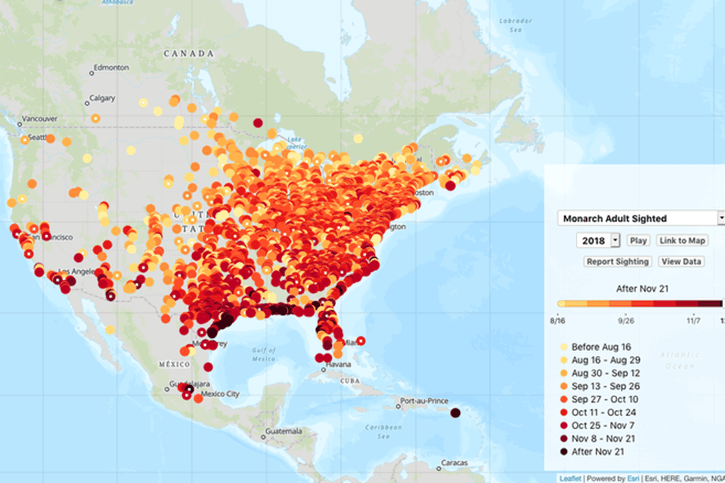
In one project, I helped a Digital Humanities team bring historical literature to life, stepping through a timeline-based tour of London with the characters in Daniel Defoe’s A Journal of the Plague Year. In another project, I supported the nonprofit Journey North, leveraging their 25-year—and ongoing—database of observations and sightings, allowing viewers to compare species' migration patterns or arrival, departure, and emergence dates.
The majority of digital maps you encounter depend upon one of those map providers listed above. There's simply too much overhead in hosting your own map tiles on a performant server that can respond to all those requests as users pan and zoom. It can be done, but unless you can allocate resources to maintain a responsive map server, it's better left to the professionals and platform providers. Which one to choose?
If you're working on a nonprofit project trying to make the most of your budget, I'd like to share the toolkit I've put together, which leverages robust, developer-friendly APIs, open-source libraries, and free-for-non-commercial-use service plans.
Before looking at which combination of platforms and services provides the most mileage, I established an important distinction in the types of maps we were producing and the support we would need.
As you navigate a digital map at a particular zoom level, your web browser is continually loading square-shaped images—map tiles. If you change your zoom level, in some cases you receive a whole new set of map tiles. (This may not be true in many cases today, where map images are vector images rather than bitmap, but is typically true for those described here.) Some of the more detailed maps you see merge your visual data into those sets of map tiles. For large datasets and one-time projects, this can result in a much more performant map, as the browser is not rendering a multitude of markers using JavaScript, and can empower a greater level of control over your map design, or integrated map and data visualization styles. Those benefits come with a price, though. If you use a service like Mapbox Studio or ArcGIS to upload data and design and generate map tiles, you're dependent on that service to host those map tiles on a server that can respond to requests to zoom and pan those tiles. That service necessarily costs money.
In contrast, the maps I've worked on plot data on a standard map as markers (or pins, or shapes, or paths). In the Digital Humanities project ("Itinerary"), this is all that was needed. We also went this route with the Journey North data for a number of reasons, including but not limited to pricing considerations. We do have maps that feature more than 3,000 pins, which is something of a performance threshold. Things start to lag when you exceed that volume of markers and flattening your data points as map tiles mitigates that overhead. But our maps feature real-time data every season, with the latest approved sightings appearing on maps as those sightings are posted. Periodically manually uploading data to generate map tiles to render snapshot maps was not logistically realistic.
Thus I make a distinction between two categories of maps: custom maps whose map tiles must be hosted on a paid-for platform, which have their place and offer many benefits, and "live" maps, where we're plotting points, shapes, or paths on standard maps, writing JavaScript code to leverage a provider's API. Here, I focus on the latter.
Your map-making journey begins with data: data residing in a database you have access to; data that you've compiled from other sources; or data that you're recording to display in the future or in real-time. The only real requirement to put that data on a map is that each data point has latitude and longitude values, or a corresponding set of latitude and longitude coordinates to define a path or shape. Data points in the maps I've worked on also include dates, which we use to render those points on a time scale. Because these data points represent a location at a specific time, I call our data points events.
In both the Itinerary and Journey North projects I've process data to output it in the GeoJSON format. Because our data points—events—have additional properties, they're formatted as feature objects in GeoJSON. We can store any additional data attributes as properties for each feature object, allowing us to pass image URLs and comments for the popup; date and time values for our timeline; and design cues to our map layer.
Our use of GeoJSON on the Itinerary project was limited to reference files we manually created to define the boundaries of parishes or paths taken, which a corresponding event would light up. We used Jekyll to generate the shell of the map application, and looped through CSV files to generate JSON data files that we looped through to create markers on the map or to highlight a corresponding parish.
Journey North maintains a fairly simple sightings database, containing latitude and longitude, sighting date and time, comments, and image URL data for each sighting event. When we fetch that data, we format it for transmission as GeoJSON in PHP before handing it off to our application’s JavaScript for rendering on our maps. Our JavaScript code does not leverage any automatic GeoJSON functions in our mapping library of choice, but using a recognized, widely-embraced format for our data means it’s ready for sharing via API with others in the future, and that the tools we’re building have adopted an existing, common language.
Because we're using JavaScript to interact with a mapping API and put events on a map, your data will need to be consumable by JavaScript. JSON is a logical choice, and GeoJSON is a lightweight standard for mapping applications.
Your map application is comprised of JavaScript leveraging a library that can interact with one of the map providers' APIs.
If Google Maps API was completely free and not subject to pay-as-you-go pricing thresholds, I might be compelled to go that route despite my reservations about placing all our eggs in Google's basket. But I think there are better choices out there, from providers dedicated to developing and supporting mapping platforms, and have been rather determined to make those work. Ultimately that mission paid off for Journey North from a pricing perspective as well. (Note: We replaced a number of legacy Google Maps API dependencies for geolocation and location picker tools from Journey North in 2018 with the following solutions to reduce costs due to pay-as-you-go. Journey North receives many map views, and API hits for associated services, during peak season updates.)
Esri's offerings were suggested for Journey North, as they're well-established in the scientific and GIS communities. I've always been a big fan of Mapbox and recommend reading their values statement.
Which came first: Choosing a mapping platform compatible with the library you like, or choosing a library compatible with the mapping platform you'll use? In our case, it was a little bit of both, and we ended up with something of a combination of Mapbox and Esri offerings.
To put Journey North's data on the map, we use the open-source Leaflet.js library. I'd previously worked with Leaflet.js using a Mapbox base layer on the Itinerary project. I consider Leaflet.js to be most closely associated with Mapbox, as that is where its developer is based, but you can specify base layer maps from other providers. We use Esri's Esri Leaflet plugin for Leaflet.js to instantiate our Esri basemap layer. It is via the Esri Leaflet project’s Terms of Use that we were able to identify it as a developer-friendly free option. The combination of Leaflet.js—a robust, well-documented, "open-source JavaScript library for mobile-friendly interactive maps"—and Esri's free base layer maps gives us a full-featured, free package to support Journey North's mapping application.
This is the "live" map route I outlined above, where data is plotted directly on a standard map instance using JavaScript. This enables Journey North to feature the latest approved data in real-time. We're also able to slice that data into date intervals that we load in layer groups on the map so that we can scrub a timeline back and forth to rewind and advance the story of a species' migration or the advance of a season. The Itinerary project similarly revolved around a timeline that one can step through or play to see the story unfold.
Exploratory projects like Itinerary, accessed by a smaller audience, can fly under the radar when it comes to pricing, with any of the mentioned platforms at your disposal as long as one is willing to put a credit card on file. As is often the case in web and application development, though, the choices we make tend to comprise our go-to toolkit—we become well-versed in those platforms and libraries we choose for our first project and they facilitate our efforts in the future, along with efficiencies that help us work effectively amidst budget and time constraints.
The toolkit I've outlined here has served Journey North well, supporting a few hundred thousand views a month during peak sightings season. As any nonprofit can relate to, Journey North is under continual pressure to do a lot with a little, and while maps are a cornerstone of the website and community, there are other priorities and objectives. Saving money on recurring expenses and third-party services affords more time to work on enhancements and optimization.
Where there are limitations, as with performance on high volume maps, there are options. If custom map tile maps are not viable, many in the mapping community recommend clustering pins to reduce the number of elements managed by JavaScript and reduce lag when panning and zooming. Clustering pins is supported by a handful of Leaflet.js plugins, one of "hundreds" of plugins available and listed on the Leaflet.js site.
A great thing about developing digital maps is that all of the platforms behave pretty similarly, and you can translate your experience with one platform into diving into another. I encourage you to experiment with all of them—and with different types of maps—as you build your own toolkit. What's worked well in my case may not suit your needs, and you may not be subject to the same constraints as my projects. At the same time, I can attest that the approach outlined here has empowered us with an affordable, stable, robust platform for rich, data-driven interactive maps that we've come to rely on to engage a community of users and tell their stories.
I hope your map-making journey is as rewarding.
More than just a digital analogue of our road maps of old, digital maps can transcend serving as interface devices and become vehicles for data visualization and powerful visual storytelling. I've worked with teams to develop rich, multi-dimensional data-driven maps that engage viewers in historical events and citizen science observations across both time and geography.
In one project, I helped a Digital Humanities team bring historical literature to life, stepping through a timeline-based tour of London with the characters in Daniel Defoe’s A Journal of the Plague Year. In another project, I supported the nonprofit Journey North, leveraging their 25-year—and ongoing—database of observations and sightings, allowing viewers to compare species' migration patterns or arrival, departure, and emergence dates.
The majority of digital maps you encounter depend upon one of those map providers listed above. There's simply too much overhead in hosting your own map tiles on a performant server that can respond to all those requests as users pan and zoom. It can be done, but unless you can allocate resources to maintain a responsive map server, it's better left to the professionals and platform providers. Which one to choose?
If you're working on a nonprofit project trying to make the most of your budget, I'd like to share the toolkit I've put together, which leverages robust, developer-friendly APIs, open-source libraries, and free-for-non-commercial-use service plans.
Choosing a direction
Before looking at which combination of platforms and services provides the most mileage, I established an important distinction in the types of maps we were producing and the support we would need.
As you navigate a digital map at a particular zoom level, your web browser is continually loading square-shaped images—map tiles. If you change your zoom level, in some cases you receive a whole new set of map tiles. (This may not be true in many cases today, where map images are vector images rather than bitmap, but is typically true for those described here.) Some of the more detailed maps you see merge your visual data into those sets of map tiles. For large datasets and one-time projects, this can result in a much more performant map, as the browser is not rendering a multitude of markers using JavaScript, and can empower a greater level of control over your map design, or integrated map and data visualization styles. Those benefits come with a price, though. If you use a service like Mapbox Studio or ArcGIS to upload data and design and generate map tiles, you're dependent on that service to host those map tiles on a server that can respond to requests to zoom and pan those tiles. That service necessarily costs money.
In contrast, the maps I've worked on plot data on a standard map as markers (or pins, or shapes, or paths). In the Digital Humanities project ("Itinerary"), this is all that was needed. We also went this route with the Journey North data for a number of reasons, including but not limited to pricing considerations. We do have maps that feature more than 3,000 pins, which is something of a performance threshold. Things start to lag when you exceed that volume of markers and flattening your data points as map tiles mitigates that overhead. But our maps feature real-time data every season, with the latest approved sightings appearing on maps as those sightings are posted. Periodically manually uploading data to generate map tiles to render snapshot maps was not logistically realistic.
Thus I make a distinction between two categories of maps: custom maps whose map tiles must be hosted on a paid-for platform, which have their place and offer many benefits, and "live" maps, where we're plotting points, shapes, or paths on standard maps, writing JavaScript code to leverage a provider's API. Here, I focus on the latter.
Bring your own data
Your map-making journey begins with data: data residing in a database you have access to; data that you've compiled from other sources; or data that you're recording to display in the future or in real-time. The only real requirement to put that data on a map is that each data point has latitude and longitude values, or a corresponding set of latitude and longitude coordinates to define a path or shape. Data points in the maps I've worked on also include dates, which we use to render those points on a time scale. Because these data points represent a location at a specific time, I call our data points events.
In both the Itinerary and Journey North projects I've process data to output it in the GeoJSON format. Because our data points—events—have additional properties, they're formatted as feature objects in GeoJSON. We can store any additional data attributes as properties for each feature object, allowing us to pass image URLs and comments for the popup; date and time values for our timeline; and design cues to our map layer.
Our use of GeoJSON on the Itinerary project was limited to reference files we manually created to define the boundaries of parishes or paths taken, which a corresponding event would light up. We used Jekyll to generate the shell of the map application, and looped through CSV files to generate JSON data files that we looped through to create markers on the map or to highlight a corresponding parish.
Journey North maintains a fairly simple sightings database, containing latitude and longitude, sighting date and time, comments, and image URL data for each sighting event. When we fetch that data, we format it for transmission as GeoJSON in PHP before handing it off to our application’s JavaScript for rendering on our maps. Our JavaScript code does not leverage any automatic GeoJSON functions in our mapping library of choice, but using a recognized, widely-embraced format for our data means it’s ready for sharing via API with others in the future, and that the tools we’re building have adopted an existing, common language.
Because we're using JavaScript to interact with a mapping API and put events on a map, your data will need to be consumable by JavaScript. JSON is a logical choice, and GeoJSON is a lightweight standard for mapping applications.
Making your map
Your map application is comprised of JavaScript leveraging a library that can interact with one of the map providers' APIs.
If Google Maps API was completely free and not subject to pay-as-you-go pricing thresholds, I might be compelled to go that route despite my reservations about placing all our eggs in Google's basket. But I think there are better choices out there, from providers dedicated to developing and supporting mapping platforms, and have been rather determined to make those work. Ultimately that mission paid off for Journey North from a pricing perspective as well. (Note: We replaced a number of legacy Google Maps API dependencies for geolocation and location picker tools from Journey North in 2018 with the following solutions to reduce costs due to pay-as-you-go. Journey North receives many map views, and API hits for associated services, during peak season updates.)
Esri's offerings were suggested for Journey North, as they're well-established in the scientific and GIS communities. I've always been a big fan of Mapbox and recommend reading their values statement.
Which came first: Choosing a mapping platform compatible with the library you like, or choosing a library compatible with the mapping platform you'll use? In our case, it was a little bit of both, and we ended up with something of a combination of Mapbox and Esri offerings.
To put Journey North's data on the map, we use the open-source Leaflet.js library. I'd previously worked with Leaflet.js using a Mapbox base layer on the Itinerary project. I consider Leaflet.js to be most closely associated with Mapbox, as that is where its developer is based, but you can specify base layer maps from other providers. We use Esri's Esri Leaflet plugin for Leaflet.js to instantiate our Esri basemap layer. It is via the Esri Leaflet project’s Terms of Use that we were able to identify it as a developer-friendly free option. The combination of Leaflet.js—a robust, well-documented, "open-source JavaScript library for mobile-friendly interactive maps"—and Esri's free base layer maps gives us a full-featured, free package to support Journey North's mapping application.
This is the "live" map route I outlined above, where data is plotted directly on a standard map instance using JavaScript. This enables Journey North to feature the latest approved data in real-time. We're also able to slice that data into date intervals that we load in layer groups on the map so that we can scrub a timeline back and forth to rewind and advance the story of a species' migration or the advance of a season. The Itinerary project similarly revolved around a timeline that one can step through or play to see the story unfold.
Charting a course
Exploratory projects like Itinerary, accessed by a smaller audience, can fly under the radar when it comes to pricing, with any of the mentioned platforms at your disposal as long as one is willing to put a credit card on file. As is often the case in web and application development, though, the choices we make tend to comprise our go-to toolkit—we become well-versed in those platforms and libraries we choose for our first project and they facilitate our efforts in the future, along with efficiencies that help us work effectively amidst budget and time constraints.
The toolkit I've outlined here has served Journey North well, supporting a few hundred thousand views a month during peak sightings season. As any nonprofit can relate to, Journey North is under continual pressure to do a lot with a little, and while maps are a cornerstone of the website and community, there are other priorities and objectives. Saving money on recurring expenses and third-party services affords more time to work on enhancements and optimization.
Where there are limitations, as with performance on high volume maps, there are options. If custom map tile maps are not viable, many in the mapping community recommend clustering pins to reduce the number of elements managed by JavaScript and reduce lag when panning and zooming. Clustering pins is supported by a handful of Leaflet.js plugins, one of "hundreds" of plugins available and listed on the Leaflet.js site.
A great thing about developing digital maps is that all of the platforms behave pretty similarly, and you can translate your experience with one platform into diving into another. I encourage you to experiment with all of them—and with different types of maps—as you build your own toolkit. What's worked well in my case may not suit your needs, and you may not be subject to the same constraints as my projects. At the same time, I can attest that the approach outlined here has empowered us with an affordable, stable, robust platform for rich, data-driven interactive maps that we've come to rely on to engage a community of users and tell their stories.
I hope your map-making journey is as rewarding.

