


I am an expert at filling out forms.
I fill them out when I'm ordering something online. I fill them out when I’m applying for a class. Or for a new driver's license. And for every appointment. And I fill them out when I donate or sign up for an email newsletter.
This means you’re likely an expert as well!
Because we are presented with so many forms to fill out online, a particular pet peeve of mine is a poorly designed form. A bad form peeves me on many levels:
- I get frustrated when the form wastes my time asking for unnecessary information.
- I get frustrated when forms are not mobile-friendly.
- I get frustrated when the form refreshes and doesn’t save my previous entries.
But I also know I’m one of the lucky ones; I have a name that’s considered common and has enough characters. I‘m also cisgender and identify as female. My name also isn’t hyphenated. So filling out forms — even if they are problematic — is easier for me than a whole lot of others.
Many forms create barriers to filling out information, including obstacles regarding race, gender, and even relationships. Web editors with the best intentions could unintentionally create a barrier for a user, which means the user will get frustrated with your brand and abandon your form. And you won’t get the conversions you want.
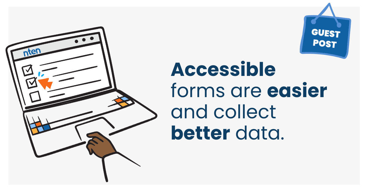
In the interest of abolishing terrible forms everywhere, here are some simple steps to make your forms more inclusive, delight your audiences, and get the conversions you need.
Why do you need to know if I’m a Captain?
Some forms ask for your title (also known as honorifics): Esquire, Professor, Doctor, even Captain! I’m trying to donate to your fundraiser, not pilot your ship!
But that’s not the only unnecessary field I’ve encountered. I recently went to go work out at a facility. I was willing to hand over cash, but they insisted I fill out an online form, which took way longer than handing over cash. But I understood. They wanted me to fill out an online waiver so I wouldn’t hold them liable if I got injured in their facility.
That's why I found it very odd that they insisted on asking me for my cell phone carrier. It was a required field! But what wasn’t a required field? The “emergency contact.”

The lesson here: don’t ask me for information you don’t need. It’s a waste of my time and feels like creepy data collection.
Let’s talk about gender.
If a woman is filling out your form, do you need to know her marital status? This tweet sums it up well:

Men never have to reveal their marital status. Why should women?
What about those forms that ask you to choose a gender? Many forms ask if you are male or female, but that’s exclusive of those who identify outside of the binary of male and female.

Ask yourself: does your organization really need to know this? If it does, fine. But please recognize that not everybody fits into those two boxes. So ensure that your forms are inclusive by offering more options so your users don’t feel excluded.
The takeaway:
- Be inclusive of all genders.
- At the least, consider adding, “I’d prefer not to say.”
- If your organization needs this information, be mindful and respectful of the words chosen and what those words mean to the end user.
Account for all kinds of names.
Have you ever seen a racist form? They exist. Ask any of the billions of people worldwide who have last names with just two characters:


There are billions of people who can’t buy your products or sign up for your event if your forms block them from doing so.
Forms also can have trouble recognizing certain ethnicities or accents. These two Irish Twitter users were commiserating about having some trouble filling out forms:


What if your name is hyphenated? Some forms reject that too.

You know it’s bad when you’ve lost the support of 4th graders.
Not everyone has a name like John Smith. There are accents, hyphens, apostrophes, short names with a few characters, long names with a lot of characters, and names where the first name and last name are switched.
W3.org explains it well and in more detail: “People who create web forms, databases, or ontologies are often unaware of how different people’s names can be in other countries. They build their forms or databases in a way that assumes too much on the part of foreign users. ”
The takeaway: know your audiences so you can accommodate their naming needs. Account for as many naming conventions as possible.
Account for all races.
Unfortunately, forms can impose racial identities on people without respect for how they identify themselves by not offering enough options. If you must ask for race on your form, allow for a wide variety of options and acknowledge differences between similar sounding options: for example, “Black” may not be the same as “African American,” and “Hispanic” may not be the same as “Latin(a/o), & Latinx.”
Account for all relationships.
We all know relationships are complicated. When asking for an individual’s relationship with another, be respectful of those complexities:
- “Spouse/partner” over “husband/wife.”
- “Parent/guardian” over “mother/father.”
- “Child” over “son/daughter.”
- “Sibling” over “brother/sister.”
This sends an immediate message to the user that you respect those in their lives even if they don’t fit neatly into an expected norm.
More steps you can take.
- Account for keyboard navigation: ensure all form fields can be navigated to (and away from) only using a keyboard. From assistive technologies to broken track pads — this is a must.
- Include form labels: include meaningful and descriptive form labels to alert all users about what is expected of them.
- Show progress: if the form is extensive, a progress bar is nice to manage the time expectations for the user and what information is needed at each step.
- Provide enough contrast: many forms try to use stylish, grayed-out text. A grayed-out button or text is acceptable if it’s an inactive element that is not usable. But if a user is supposed to get information about the form or interact with a field, ensure proper color contrast is used.
- One more time … don’t ask for more than you really need. Take a hard look at what information is critical for you to capture. Then leave out the rest.
Before you launch, test. And test again.
Get feedback on your form before you launch it. And get that feedback from diverse voices to ensure you’ve covered as many scenarios as possible.
You could even use the testing opportunity as a way to connect with your brand ambassadors who love and support your nonprofit the most, bring in your best supporters, and encourage them to bring in as many friends as possible across ages, genders, marital statuses, races, and more. Make a day of user testing. Offer them a gift — a gift card, free lunch, or tour of your organization — for their feedback on your form. You will get the information you need as well as introduce a whole lot of new supporters to your organization!
Follow these steps to make your forms more inclusive and accessible.
Forms are a necessary part of online life, and we all must fill them out. While this is not an exhaustive list (though it’s close), these steps will go a long way to keep your forms human-centric and build trust with those who choose to share their data with you.
Learn more
Making presentations accessible
10 things to consider when planning a website design (or re-design)
Improving accessibility in nonprofit workplaces
Allison Manley
she/her
Director of Marketing & Communications, Kanopi Studios
Allison is a recovering (and award-winning) designer who applies her creative and organizational skills to marketing strategy for Kanopi Studios. Her diverse, multi-disciplinary background — which in addition to design includes glassblowing, publishing, podcasting, and figure skating — contributes to strong relationships to which she offers a broad perspective.
As someone born disabled (corrected with surgery) who is the mom of a trans kid and who works for an agency with an accessibility focus, Allison is particularly interested in making the internet as accessible and inclusive as possible.

